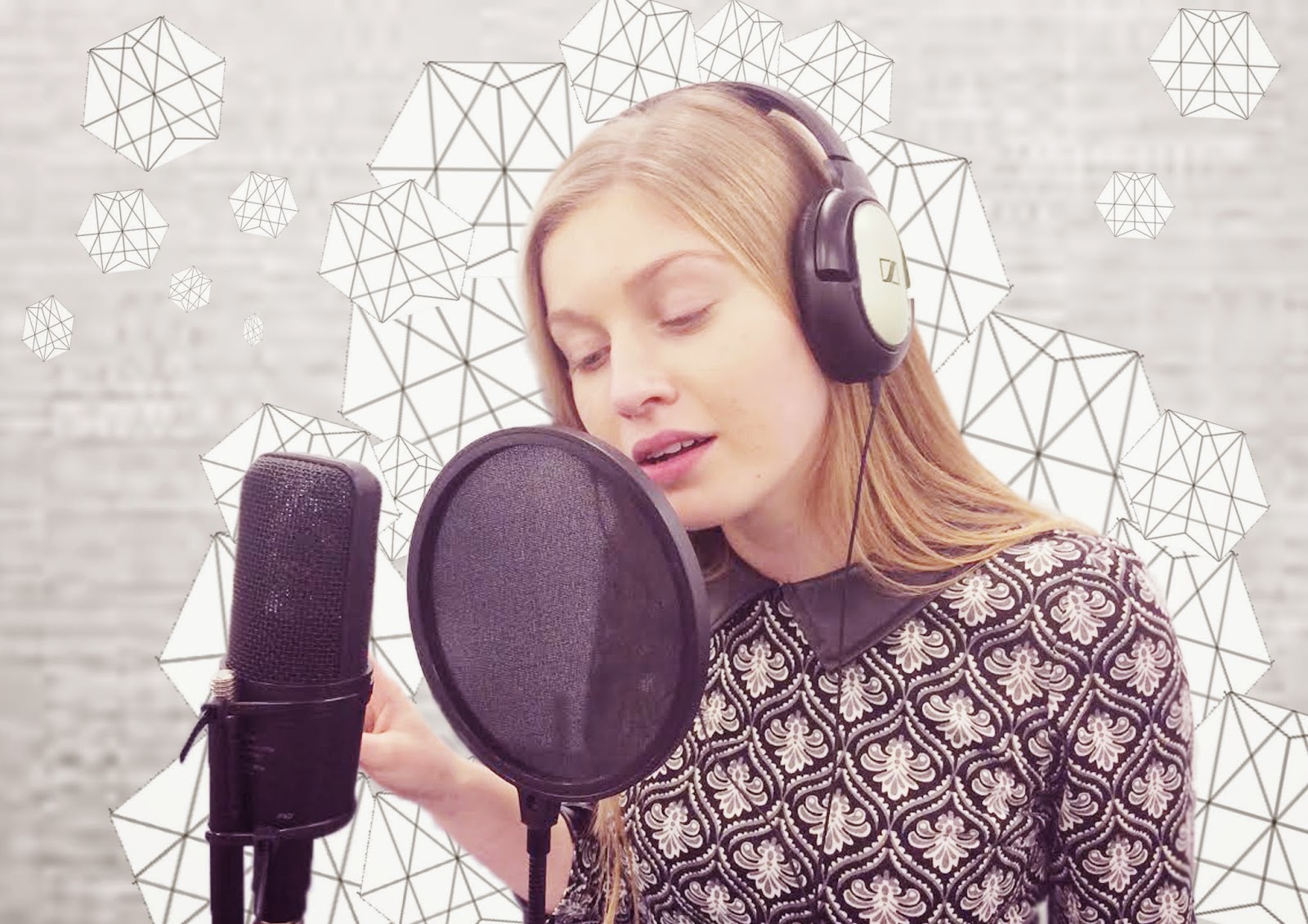
I started out with two ideas, the first one I wanted to look quite clinical and robotic which fits the meaning of the song and original music video; saying how she I only human, she's not a robot and feels emotions. I decided to invert the initial figure to create this idea. I then decided to add a glimpse of the original image in the second human title, which I feel empathises the robot overall feel. I've also included a geometric hexagon as a symbol that I want to include as a recognisable logo throughout my auxiliary tasks linking everything together. The reason behind the geometric is that I feel it emulates that robotic mechanical feel that I want to portray. It also gives a modern feel to the overall look, something I think my modern audience would appreciate.
It a working progress and I still need to work on making the edges of the images look a lot smoother feel, making it look more professional.
My second idea, perhaps my least favourite of the two (the bottom image) gives a more girly, cartoon feel which I feel does link to my target audience. I have included the same geometric shape/symbol again to create that robotic feel however, I feel the overall appearance has a far less modern feel, and does depict the overall message I want to portray, which I feel is shown better through my first option.


No comments:
Post a Comment